Tuesday 28 February 2017

Backgrounds on a budget by Lindsey Campbell

One of the first pieces of advice I received when I began my Bible Art Journalling journey was "If you don't know where to start, get some colour on the page".

I find it's often easier to "get to business" when there is a background ready and waiting - And when I just feel like "playing" I'll create a few "background" pages in my journal so they're ready to work with.

There are so many ways to create a background, whatever your favourite tools and techniques, but it's so easy to be tempted by the huge array of materials available in the craft shops.

But it really isn't necessary to buy lots of new tools and colours - there are plenty of options available for low cost - these are a few I discovered:

Watercolour

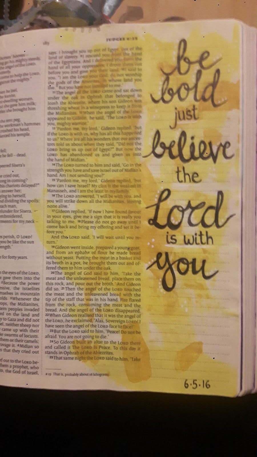
Using watercolour pencils, simply colour the page with different shades, going darker towards the edges, then smudge the colours together with a wet brush.

This technique can give a "parchment" effect - great for an "aged" appearance and a good base for typography work:


If you have more time, building up layers can give beautiful effects like this (see this video for a quick and easy demonstration).


I also used the "squidging on some hand gel" technique to create lighter areas one the layering was complete.

Acrylic

Dabbing and sponging are very quick and easy - using a wet wipe or (as I do) a corner sliced off a washing up sponge - you can use a palette, or just squirt some colours straight onto the page and dab from there...... If you find you need to highlight an area for your design, simply layer a lighter colour over the background where needed.


Scraping colour with a credit card or ruler gives a geometric feel, and toothbrushes are great fun for splattering.


For a different design, use a bit of shaving foam, to create marbling effects without expensive inks and additives....


Adding texture and depth

Once you have some colour, that may be all you need to "base" your work. Or you may wish to build up some interest. Adding another technique, such as splattering on top of watercolour can be interesting. Stamps and stencils are great and create very beautiful effects - but I don't have any, so I improvise:


A net from the top of a box of oranges makes a great stencil, and textured wallpaper samples from the DIY shop work really well for "stamping" - dab on some acrylic, "print" on some scrap paper to remove excess, then "print" on your work, using a rolling pin for even pressure if needed. Then there's my favourite - bubblewrap - works really well, and you can use one piece over and over.


Quick and Easy

Finally - be on the lookout for interesting backgrounds in magazines (advertisements are often good for blocks of colour without text) and packaging - start a squirrel-store of cut-outs and pages and you'll never be short of a background, or a picture just waiting for some text.


Be Brave

I confess I'm no expert, but these are the tricks and techniques I developed, learned from others through Bible Art Journaling UK and picked up from the Pinterest, Youtube and  Google.

If there are any techniques here you haven't tried - be brave and give it a go - and share your own budget ideas with the rest of us!

Happy journalling

Tuesday 21 February 2017

Acrylic Paint in your Bible! by Claire Graham

You put acrylic paint ... in your Bible!!
Yes! And I love it :-) I love the vividness of colours that acrylics bring and also the many different ways you can use them... here's just a few...
Scraping with a card - literally put a dot of acrylic paint on the edge of an old gift card or similar and scrape it across the page...

I've learnt the hard way that some colours work better than others (if you want to see the text once you're done!) and to use the tiniest amount of paint... 

Smearing with a baby wipe- again, just use a small amount on the wipe and smear away, the colours are a bit muted this way but you can definitely read the words through afterwards! 

Using the wrong end of a paintbrush ... dip it in the acrylic paint and use to make beautiful dots of colour... when dry the page is beautifully tactile too! 


Or... paint with it! Thinning the paint with water or liquitex matt medium helps to make it more translucent.


You could also splatter it off a stiff brush or old toothbrush.

Or print with it (for this page I turned a loo roll into a heart and secured it with an elastic band and then printed with it)

As I've mentioned before I'm an avid page preparer and always use liquitex matt gel medium to prepare my pages... in theory if you're using acrylics on a Bible page you don't need to as when the acrylic dries it forms a plastic-like barrier... but it depends how much of the page you're covering with the paint and what else you're using on it ... it's up to you if you risk it or not ;-)


Tuesday 14 February 2017

Watercolours in my Journaling Bible Part 1 - by Deborah Gregg

I do enjoy using watercolour paints, there's something really relaxing about dabbing, washing, dripping, flicking and moving the paint over the pages, sometimes drying the page between layers, and sometimes allowing the colours to blend together (trying to avoid accidentally mixing 'mud' brown). 

I thought I'd share a step-by-step for a few of my watercolour pages, perhaps over a series of blog posts over the coming few months.

The biggest challenge when using watercolour paints in my Bible is of course the extremely thin paper - almost the opposite to the heavy, thick, crinkle-resistant watercolour papers that would normally be used for these paints. So to help with this, I (usually) try to use the minimum amount of water necessary, and (usually) prepare the page first with a coat of clear gesso. I use Art Basics or Dina Wakely Clear Gesso (not much difference in my opinion, both are great). I first put a craft sheet (made from silicone) or an old piece of A4 scrap paper under the page. I use a cut up cheap kitchen sponge to apply the clear gesso in single strokes working from the centre out to the edges of the pages. Gently, gently, don't rush!

I also use a really useful heat tool to help dry gesso and paint in between layers. It's like a hairdryer but with very little air! A hairdryer works well too, on low speed, just watch that the page doesn't flap too much in the breeze or it might stick to itself! (yep - been there, done that).

I was blessed to receive a beautiful set of Japanese watercolour paints - Kuretake Gansai Tambi - as a birthday present a while back. The colours are rich and vibrant, and come with a few shimmery metallics too which are gorgeous. I also have a small pocket-box of 12 half-pan watercolours in my Bible Art Journaling 2Go bag that I can take out and about with me, I use these with waterbrushes - maybe I'll talk about them another time! 

The passage I've chosen is from Lamentations 3v21-26. This is a familiar passage that kept cropping up in different ways, I felt God was speaking to me recently and showing me something new I hadn't seen before. 

In Emily P Freeman's book 'Simply Tuesday', she talks about how we can often become so overwhelmed by our busy daily lives:
If I were a robot, I would need a re-boot. Let's start this girl over, she's overheating. I wonder if the Lord had that in mind when Jeremiah made his lamentation: "The Lord's loving kindnesses indeed never cease; for his compassions never fail. They are new every morning; great is your faithfulness." Lam 3:22-23
I've felt challenged lately to try to make a little adjustments to my day to day routine, to hopefully make a big overall difference, and sleep is one of these areas. As a night-owl, I struggle with the concept of going to bed at a reasonable time, when I'm wide awake and enjoying the peace of a quiet evening. I am blessed that I do usually sleep well, but am definitely not a morning person. (Ask my husband!).

I may never become a natural morning person, but God has been showing me that change is possible, and a bit more balance would benefit me and my family! And my morning prayer time...
I've been encouraged to consider that sleep and rest is a good thing, a blessing and a gift. Sleep resets my soul, mind and body, and leads me into God's great faithfulness and new mercies for me every single morning.
So, to journal this passage in my Bible, I decided to use my lovely Kuretake watercolours to try to do some sunrise-coloured paint dabs. That's the best description I can come up with for the rough idea that was in my mind...! Which looked like this:

You can see that as the page was wet, it crinkled. I don't mind the crinkle at all, but it is a warning that the page is very weak and vulnerable and will rip easily at that stage. So I tried to dab excess water with an old rag as I went along, and was just painting very gently. Then I dried the page with my heat tool.

After deciding what words I wanted to use, I thought I'd use a Versafine inkpad and a small alphabet stamp set. 
Which is when I discovered two things: firstly that although the page was dry, the ink still bled really badly and the crisp outline of the stamps went all fuzzy after a couple of minutes!!! Uh Oh.

 The second thing I discovered was that my best friend Baby Wipe worked wonders - I am convinced this is because the page was prepped with clear gesso - the smudgy ink just wiped off! Yay!!!
As some of the background was now looking a bit sorry, I decided to go for a collage effect in order to still use the little stamps, and to re-direct the eye away from the dodgy background. I just used some cheap printer paper, stamped each word, and ripped them up.
They looked a bit too crisp, so I scrunched them up....
Then unfolded and brushed the edges with some raspberry pink Tim Holtz Distress Ink (you can use this technique with any ink pads, just allow them to dry)
I then stuck them down with Pritt Stick. I added a few quotes underneath to remind me of what God had been showing me recently.

I hope this blog post has helped encourage you to have a play with watercolours, mistakes can be worked around, or collaged over if you need to, just have a go! This process was really fun, a bit of a fiddle, but really helped me to join together some of the thoughts and quotes and verses that God has been speaking to me about lately. 

I wonder what He is speaking to you about?


Tuesday 7 February 2017

Introducing British Bible Art Journaling Stamps - by Sarah Anderson

I am a regular contributor to Craft Stamper magazine but when the editor asked me to write an article for March I really wanted to ask if I could do a bible art journaling page.  That was very scary as this is a mainstream mag so I asked some close friends for prayer and they were all very encouraging.  


And so was the editor!  As long as the technique could be used out of a bible she was happy for me to do the article.


When the article came out last Friday it made me cry as they didn't just feature my step by step but included other pages from my bible.  My go to when I'm journaling is just my fine, black bic pen and occasionally some watercolour but that's not something you can write about in a stamping magazine!!  I also love to use deli paper, something I've written about on the blog before.


I love to stamp in my art journals and am thrilled about the recent availability of British bible art journaling stamps, thanks to the wonderful Hannah at Creative Bea.  It is brilliant to be stamping more in my bible!   


Firstly I thought I'd share again the benefits of deli paper.  It is very light and brilliant for covering up bleed through or mistakes.  The page on the left has bled through and I used deli paper on the other side.   The bleedthrough happily co-ordinates with the deli paper!


Painted deli paper also looks pretty as decoration for the edge of a page...


... and inspired by a page by Christy Fae I've cut it into mountain shapes.


Hannah has recently brought out a new set of stamps and I was privileged to get to play with them early.  I was keen to use the 'Calvary' set as much of my reading lately has been about our inheritance through the death of Christ.


If you're familiar with my bible journaling you'll know I enjoy reading a variety of translations and paraphrases.


All translations are influenced by the theology of the translator so reading a variety gives a better understanding of the meaning of the passage.  To me it's a bit like when you hear a preacher explain a verse or passage, but in a book!!  The Passion Translation's aim is to reveal the heart of God and His passion for us.  


Another favourite paraphrase of mine is Francois du Toit's Mirror which is translated "with the person of Jesus Christ Himself and His finished work as the proper interpretative lens".  


My journaling bible is an NIV, my 'go to' read but I love to add a different version in the margins in order to amplify the meaning.  My reading this morning was from James 4:8 which reads

"Come near to God and He will come near to you"
NIV


but it was the Mirror's interpretation that particularly spoke to me today so I added it to the margin.  

"Snuggle up to the warm embrace of God,
experience His closeness to you"
The Mirror

In Christ, there is no separation between God and us (Romans 8), absolutely none..... so He is as close as close can be.  I needed to remember that!